Grokker is a high quality on-demand wellness video service to make it easy for anyone to get better at what they love and connecting with a global community of enthusiasts and experts
Project Goal
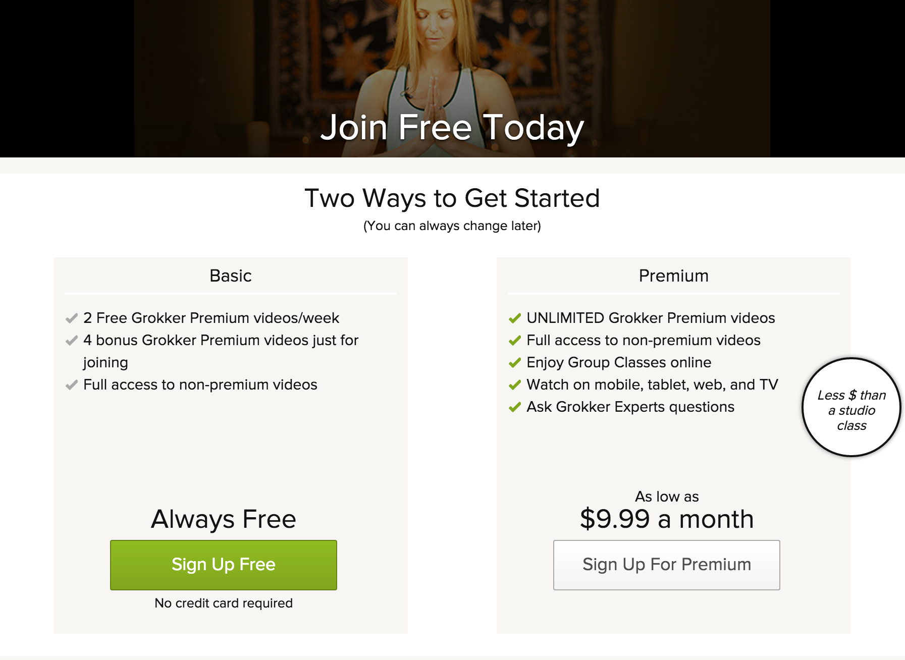
Increase user engagement by offering a freemium version of Grokker.
Context
We launched our paid subscription program in September 2014. We offered a 14-day free trial on sign up. After the trial expired, the user needed to upgrade to continue access to the premium yoga, fitness and cooking video content. Post launch of this subscription model, we saw a decline in users returning after their free trial.
We looked at our user data and saw there were two different types of users. Our active power users were willing to pay for the subscription, but our active casual users were not. Once the casual users free trial expired, they didn't return. We needed a quick solution to keep them from leaving for good.
Hypothesis
If we give our active casual users a good experience to Grokker they will remain active as a free user. If we can retain them now, we can up-sell them in the future when we have more features they are willing to pay for.
Process
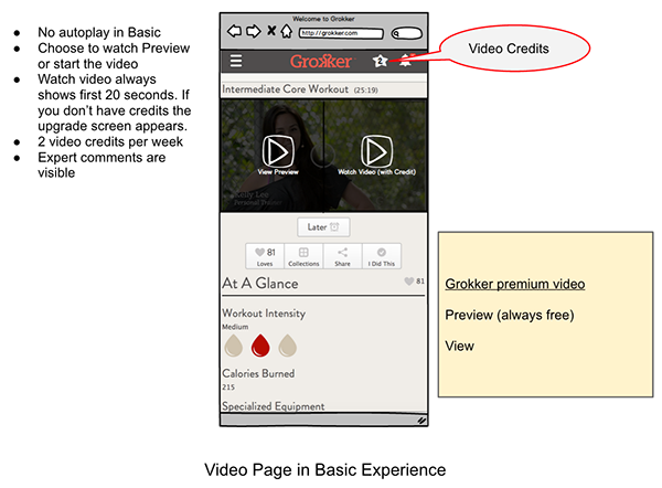
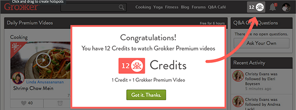
The product team came up with a basic experience that was based on video view credits. We weren't sure if this was going to change our user behavior, so our solution needed to be an MVP to quickly validate. The happy path user flow was defined by the PM team. They had Balsamiq wires to convey the basic story of this new credit based freemium service.
I iterated on their sketches and worked on the UX flow from the guest to logged in experience.
Balsamiq sketches from Product Management
Solution
The solution was a series of experiences that included adding a module to all guest experiences (logged out), registration, first time user experience, and watching a video.
Below are items and steps that were delivered for the engineering team.
Guest module added for all logged out pages
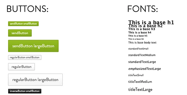
Reuse our CSS library of component
Typically we need to make minimal change the site. My hack around this is I used screen shots as my foundation and use "photoshop magic" with some help from Firebug (Inspect Element) to make the changes.
Prototype in Invision
To see how the user flow works, I use invisionapp to build a rough clickthrough experience. This helped expedite iteration and questions when handed off to engineering.
On the first screen, scroll to the bottom to get the first button.
NOTE: The "protoype was built in a happy path flow. If you've never used invision, keep an eye out for blue boxes that look like below.
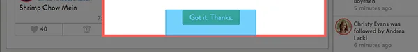
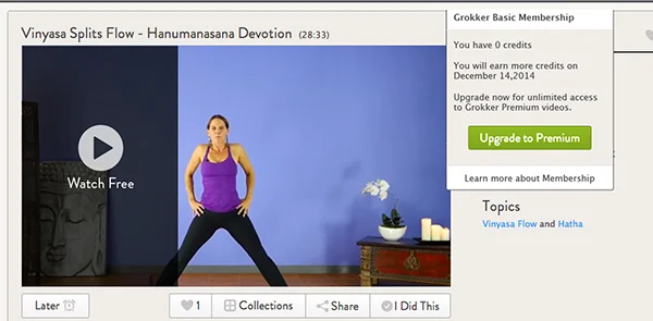
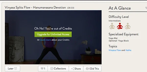
Sample screens from the experience
Results
We initially saw our users were "hoarding" credits to watch videos. We quickly made a changes encourage a different behavior, which worked. We are now testing the right number of video credits to watch.