
Grokker is a high quality on-demand wellness video service to make it easy for anyone to get better at what they love and connecting with a global community of enthusiasts and experts
Project Goal
Increase the guest to member conversion on the home page
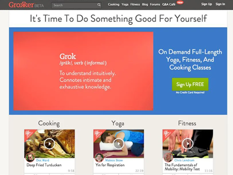
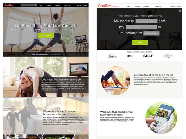
Home Page Before
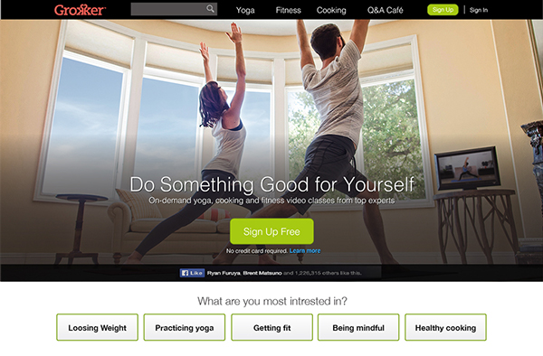
Top of Home Page After (below is the full page)
Context
Grokker is an online video network that offers expert-led videos in Yoga, Fitness, and Cooking. The company goal was to increase the percentage of users that convert from guest to member through design enhancements to our highest traffic guest experiences.
We knew our two highest trafficked pages were home page and guest video pages. We had some qualitative research on what users liked about our product, however, we didn’t know was how a user perceives us before signing up.
To help create our hypothesis, I ran a quick qualitative test to see what we needed to do.
Home page Beofre
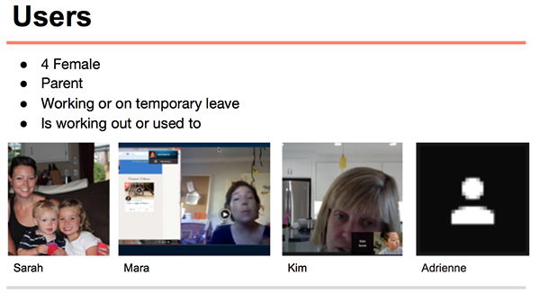
Qualitative Research
We wanted to know:
1. What impressions did the home page give the user before signing up?
2. If the user was comparing Grokker to other products and how did they perceive us to others?
3. What can we learn from competitors to increase our success?
Quick study on usertesting.com
I was able to get a general idea of what problems we had, but I wanted to know more specifics.
In depth interviews
Findings
• Our video quality was stunning in comparison to other sites
• Grokker had a better breadth of offering of content
• Free doesn’t always mean free
• Our competitors had clear messaging of their offering but didn’t want to pay before trying the product out first
• One competitor had a better way to engage the user visually
• Social credibility was important to them. This includes brand recognition and “someone I know is using this too”
• Users liked to seeing how they could imagine themselves using the product.
Hypothesis
By redesigning a home page (responsive web) that shows the user benefit, breath and convey the immersive experiences they will have, we believe the % of people completing the registration process will increase
Solution
Iterative Approach
We quickly tested out quick concepts before we were able to address all our findings. We first launched a few A/B tests by adding social credibility messaging about our offering to the home page. This did result in a less than a percent increase but didn’t result in significant percentage, so we iterated.
More dramatic changes
We realized that these small changes were not going to get us to the results fast enough. We needed to address all the users concerns to really get a lift we wanted. In the ideal world of unicorns and rainbows, we would test out multiple versions, but engineering time is limited. Our solution needed to be simple and quick to see results.
First step was to explore options get product, engineering and marketing in agreement on what to do. I quickly did quick whiteboard sketches and jumped into visual to expedite the process.
I explored two version: one featured our video content and another quiz like experience.
Execute. Execute. Execute.
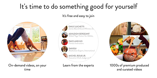
Once we agreed on the general approach, I worked with the marketing team to clarify who we are, what we do, and create the imagery to best represent that. This included an impromptu photoshoot.
5 Second Test
To ensure we addressed one of the biggest of the pain point of “Is free really free?” We ran a "5 second test."
Result
Before the start of the redesign we saw a 10% conversion from guest to member for the home page. By the end of the iterations, we saw an 21% increase.
We aren't done yet. We will always be iterating.
Final Design